HACK AESTHETICS SERIES #1
HOW TO ARRANGE A KILLER VISUALOSITIES (FOR BEGINNERS)
Hi! I'm Lily, and this is the first part in a series for people who want to do aesthetic things, but have never had a clue about how to do it.
Today's topic is how to arrange your pretty pictures. I stuck this together because I've seen people go, 'I want to do this, but I don't know how' so often, I figured someone should help out. Whether for visuals for image prompts, cr charts or visualosities. So, I thought I would stick together some handy-dandy rules I go by to arrange my pretty pictures to be nice to the eye.
This might sound hard, but I promise it's not! They're just simple design rules that have been full proof for me. Have fun! That's the real name of the game! Do not ever feel obligated to follow any of this. Enjoy your self and I just want to be helpful, so don't be afraid to ask me for help down the bottom in the comments. But remember the most important rule:
I ain't here to tell you how to live your life. You do you, my friend.
So without further adieu, let's get into it:
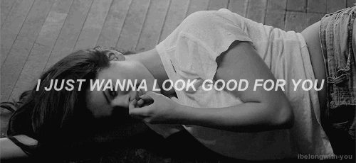
in this analogy, slinky selena is ur one day visuals singing to you
RULE #1: GET TOGETHER ALL YOUR PICTURES FIRST.
Obviously, before you start out, you want to get pictures together. There are two sites I recommend using for this. Pinterest and Tumblr. But if you have one you already like, then use it! The only thing that's really important for visuals gathering is being able to find it all in one place for when you want to start arranging.
Pinterest: Pinterest is really easy to use and it's my preference for image gathering because you can save anything to one board and it's all just there ready to go.
Tumblr: tumblr is just as fine, and there are plenty of #aesthetic tumblrs out there for you to find things you like. For tumblr, the way I have gone about it is starting a character tag on a blog of your choice, and reblogging things to it to keep it together.
Just make sure to start collecting beforehand so you get an array. The makings of your bouquet, if you like. Just frolick through the field picking things out. Knock yourself out, whatever is easier for you, just make sure you get a sizeable chunk sorted before you start to get going.
The second part is.... don't spend all your time looking for one specific type of image. Just take by the armful, get a bit of everything that reminds you of your character. Getting stuck down on one or two things just ruins the fun of it. Besides, you'll never know what you stumble on just at random. So! Have at, look for lots of things. Like these things:
RULE #1.A
Types of images you can collect and are common in visuals:
1. A STANDARD PICTURE.
2. A PICTURE WITH TEXT ON IT
3. A SINGLE QUOTE LINE WITH A WHITE OR BLACK BACKGROUND
4. A WHOLE POEM
5. A GIF *
6. A GIF WITH TEXT ON IT.
7. A MINIMALIST IMAGE ( IE, A ITEM ON A WHITE BACKGROUND )
8. A BLACK AND WHITE IMAGE.
A good rule of thumb is to get different dimensions if you can. Get some things in landscape, some in portrait. Some that are really long, some that are just really short. Variance in size as much as content.
* Treat gif sets as one big long image, rather than separate ones.
RULE #2: PICK A FORMAT YOU LIKE.
This isn't a coding tutorial, so I am not going in depth here about the way you should do it in a blow by blow breakdown. These are just things you should think of ahead of time and I am going to say you already know how to code at least a little to get up to a visual arranging stage. ( If you would like me to do this, please let me know. )
1. How many columns do I want? My preference is two, but sometimes I can go one or three. Or sometimes I can get real wild and mix them up.
2. What is my spacing on an image? Do I want them really close together? Do I want them far apart? Do I want borders around them to really pad them out? A warning here: images getting too close to each other doesn't always look work as nicely as you want. But we'll get into the why of that later on. For now, just keep it in mind. A NOTE FOR PEOPLE WHO HAVE NO IDEA HOW TO CODE ANYTHING: Dreamwidth automatically adds spacing between images when they are in a column going down. So don't fret too hard about it.
3. Do I have an overall theme for my arrangement? This can get really wild if you want, but it honestly doesn't have too. Take for instance, this visuals, it is arranged in a rainbow gradient. This one however is arranged with narrative concepts in mind. Not ready to take those big steps? Then don't! Maybe you don't want to do anything too intense and all you want to do is just arrange in a single line down your page. That's perfectly fine and looks just as good. But also feel free to get ~*~*wild*~*~. Just remember that people will 'read' in ways that they are trained to, whether that's right to left or left to right, then either way, down the page.
4. Set your dimensions. Work by width, not height. The more columns, the smaller the images will be. Deciding this ahead of time is super useful. Due to tumblr, it's always to keep in mind that often the images you want will be at a minimum of 500px-540px. You'll notice a lot of visuals end up being 500px single column width.
RULE #3: THE KEY TO ARRANGEMENT, AKA, THE CLUTTER RULE
Right, now you've got your plan sorted, onto the good shit! I wasn't sure what to call this, so we're going to go with that, and this is kind of what undercuts all my next advice, so consider this the 'fundamental' rule to arranging visuals.
I want you to cast your mind back, back to the early days of the internet. Back to when everyone decided moving pattern backgrounds with animated cartoon badly pixellated gifs over the top with fluoro pink text?
Yeah. That. Remember how bad that looked?
Granted there is no real problem with any individual elements, the problem is the clutter of too much stacked onto each other. The same applies here when making visuals. You want to be careful of your elements, and how to stick them next to each other. Whether that's in a colour wheel sense or types of images sense. You don't always have to care, it's just a good thing to keep in mind. When I finish with a visual and go 'wait, something doesn't look right', I refer back to this and then rearrange in accordance with these ideas and I usually end up much better off.
So how do you avoid clutter?
1. Go back to that little list of types of image and decide what kind of image it is.
2. Then try and avoid sticking two of the same kind next to or on top of each other.
It's really just that damn easy.
Basically, the thing to understand is that the eye gets tired and bored when presented with a lot of the same things at once, and we tend to glaze over it and find it bad. So text shouldn't be next to text or your brain goes, 'wow, that's a lot of words' and reads none of them. Or 'that's a lot of patterns' and finds them garish. So making sure to alternate between images types is what can make the world of difference between visuals being like 'Oh wow! How thoughtful' or 'Oh I'm totally overwhelmed by this'.
This is where spacing comes into play. The spacing between your pictures is so important to give images their own little area to be taken in. Just like in art galleries where they give artworks a good half meter apart to let the image stand for itself. Making things too close tends not to give the mind a chance to 'breathe'. ( There are exceptions, I've seen images place right next to each other and it looks really good ) It doesn't have to be much, but 5px is a good amount to start with.
That's it. That's the basic rules.
So if you've decided you've read enough but this sheer nonsense, then here you are, you are free! That is really the core of it, and everything post this just faffing and not required.
... But if you're a nerd about arranging this shit, here is my more 'technical details' portion where I feel makes visuals really stand out.
RULE #4: QUIET AND LOUD
So, in my head, I tend to characterise images as either Loud or Quiet. Loud is an image which has some kind of intense pattern, movement, many details, a gif ( any kind ), feature bright colours, or a poem. Anything where it takes your brain more than a second to comprehend it. I would call these a selection of 'Loud' images:


god I don't even like the two text images next to each other
On the other hand, quiet images, tend to be a single line of texts on plain coloured backgrounds, an object that appears alone on a plain background, images that are still or very stangant or block in some way, or something exceedingly minimalist in colour arrangement, especially if it's got a dulled and small colour palette. These are images I would usually class as 'Quiet':


One of the things I think is really important is striking a balance between the two. A lot of the other things still apply, don't put text next to text, gif next to gif, but don't put loud next to loud applies too. This is where quiet is so important because those are the images that let you go oh, oh okay deep breath time between all that business, like a lull in a conversation. That being said, too many quiet images can look dull by themselves. So for a little demonstration, let me take a selection of those images and rearrange them, and throw in a hardball by giving myself another gif to work with.
What even is this concept, a ballerina that moonlights as a murderer? You decide!
RULE #5: A NOTE ON GIFS
Wait, why did you say any kind of gifs are loud? Some gifs fit into the quiet rule!
Because gifs make our little squirrel brain want to watch them. See here, let me talk some brain junk: our eyes are basically always drawn to movement, always. Gifs move, that's their whole deal. So whether we like it or not, we stop to look at them more than any other kinds of image. We are compelled to watch them in case they're a predator or some shit. (Ahhh! The pastels!! They're coming for me!!)
Like right now, I bet some part of your brain is watching that ballerina twirl even as you're trying to read this. Go on, try and deny it. I'll wait.
So when handling gifs, I tend to consider them like a very ~artful~ full stop. Even if I break every other rule I just talked about, gifs will always stand by themselves and I do my best to not make them overlap more than just about any other kind of image. Otherwise, all those beautiful gifs you found will just be shouting over the top of each other for attention.
RULE #6: COLOURS
I know there is an expectation that you were taught colour theory at some point in your life. But just in case you've been busy like, idk, curing cancer or something ( I dont know what awesome paths ur life leads ) that takes up all your brain instead of colour wheels you learned in grade 2, here is a brief refresher.
 The standard theory is this:
colours next to each other complement each other.
colours opposing each other contrast each other.
Pretty simple, and there is no hard and fast rule with this. Colour is supppppppppppppppper subjective so do what feels thematically feels good to you, ya know?
But picking a strong colour and then offsetting it with it's lighter shades is always a good rule of thumb. Being aware of contrast is important, you can stick two colours together in contrast when you do it right, looks so striking and so damn good. Do not be afraid of contrast, it is your friend.
I want to stick in another trick of the brain here, when two colours are next to each other, our brain starts to compare them before we think about it, so you might think two things are the same until you stick them next to each other and it turns out they're just that half shade difference is just not what you want. Which is where my favourite thing comes into play...
RULE #7: BLACK & WHITE: THE CHEAT CODE
I love, love, love black and white images. They can be used to break up all kinds of flow problems in a really nice way without being too obvious that you're doing so. They're like the coffee pot in a perfume store, here to give your senses a bit of a breather. They also good if you want to transition between things in a artful way.
Got two colour images that are sort of close but when you stick them close together, they just don't sit right?
Stick a black and white image in the middle. Now they aren't right next to each other, the eye can't pick them apart as much. One black and white quote will do the trick.
Two minimalist coloured images and next to each other, it just looks bland and boring?
Put a black & white loud image in the middle!
Honestly, this shit is my fav. You can just throw one in now and then, and it really can just breath space into a set of pictures without overdoing it. I love those plain black background quotes with white text ESPECIALLY because they come in all kinds of shapes. They just are, mwa, chef kiss.
But wait, there is more. You can actually change any image to black and white. That's right for the low low price of your - Yeah ok I'll get on with it. Here is an example of it that I actually used in one of my visuals:

And here is how you do it, just copy and paste the below, stick in your link, and you're good to go:
Just go on, try it next time you are stuck.
RULE #8: SHAPES
Caveat: this only really matters if you're doing two columns or more. If you're just doing one, then, eh.
Moving on, in particular, this is the end of what I would call beginner things. It's linked into aspects of spacing, but I find it's sort of weird enough to need it's own kind of explanation.
Unless you're going to get wild with your coding - and for the purposes for this here tutorial, I am going to say no - everything you're going to work with when arranging stuff is squares or rectangles of differing dimensions. Some will be a big, portrait sized thing, some will be a thin, landscape-sized thing. Some are just squares. Squares will end up universally medium sized. Because. Well, square.
This one is really short: alternate shapes like you alternate everything else I've described.
This goes back to 'too many things that are the same next to each other' and what I like to think of as keeping a nice 'flow'. Our brain looks for patterns, and it will get hung up on them when you least want them too, like say you've got two squares next to each other, they come up to one line and your brain ends that like a line break. What I always look for is a sense of is a sense of cascading. To keep one image constantly feeding into the next and then into the next. So having edges not meet gives a sense of something moving forward. Have a look at pinterest or a multi-column layout on tumblr, be aware of how it loads and how you feel as you scroll down. Having images constantly feeding makes you want to keep scrolling because one image has appeared, but one below it is only partially visible to the screen, it piques your curiosity, so you need to scroll to see it next, which means there, hey, look, another one is only partially visible to the screen, so hey, look, you want to scroll to see it. This is what I call a good flow, and I find it applies to visuals just as much.
This may not be the most technical explanation of this jedi mind trick that websites use, but trust me okok. I use them both wayyy too much. Hell, if you scroll up to my example up there, I did it pretty instinctively. Making sure to alternate your image shapes is a way to make sure you've never got hard lines to make the brain think it's 'over'.
This is probably the most subjective of all the rules, because I've seen people rock block grids, so do with it what you will, but I thought I would mention it just in case you were wondering: hey is that on purpose? Yep!
RULE #9: THERE ARE NO RULES
I'm sure you know the saying rules are made to be broken. MMMHm. These are basics to arranging something, and once you know them, you can break them for effect. So make sure to consider these no more than building block and you are free to do with them what you will!
And congrats, you're done! That's it! So go, go on, have fun!

NEXT TIME: HOW TO SET UP YOUR PINTEREST & TUMBLR TO GET THE MOST OUT OF THEM.
